Product indistinguishable from competitors
The same record, the same Rega — available everywhere and almost always cheaper on a marketplace.
why the store looks the way it does
A self-initiated design concept by Julia Web Studio — the shop, its history and the 'old site' are part of the brief, not a real client.
A justification of the design concept following the logic of situation → goals → constraints → shared decisions → money. No visual decision here is presented as "because I like it" — only as a response to a condition fixed at the start.
01 · what we started with
The same record, the same Rega — available everywhere and almost always cheaper on a marketplace.
A grid of cards, filters, price. A site like that doesn't help you choose — it only lets you compare price. In a price comparison, a small shop always loses.
A seller who remembers a customer's taste, a conversation at the counter, the listening room, regulars. None of that existed in digital.
Equipment is bought on trust, not on discount. Trust has to be built before the visit to the showroom.
The store sells not records, but belonging to a community of listeners. The website did not communicate this with a single pixel.
problem statement agreed with the client
02 · goals
03 · the frame inside which decisions were made
Shooting the room, records, and people is expensive and becomes outdated instantly.
Commercial releases can't be played on the site.
Real faces of visitors can't be published.
30–60 items in a standard grid look poor.
Anything that requires daily production dies within a month.
Most traffic is phone; equipment is researched on a big screen.
04 · brand carrier — original illustration
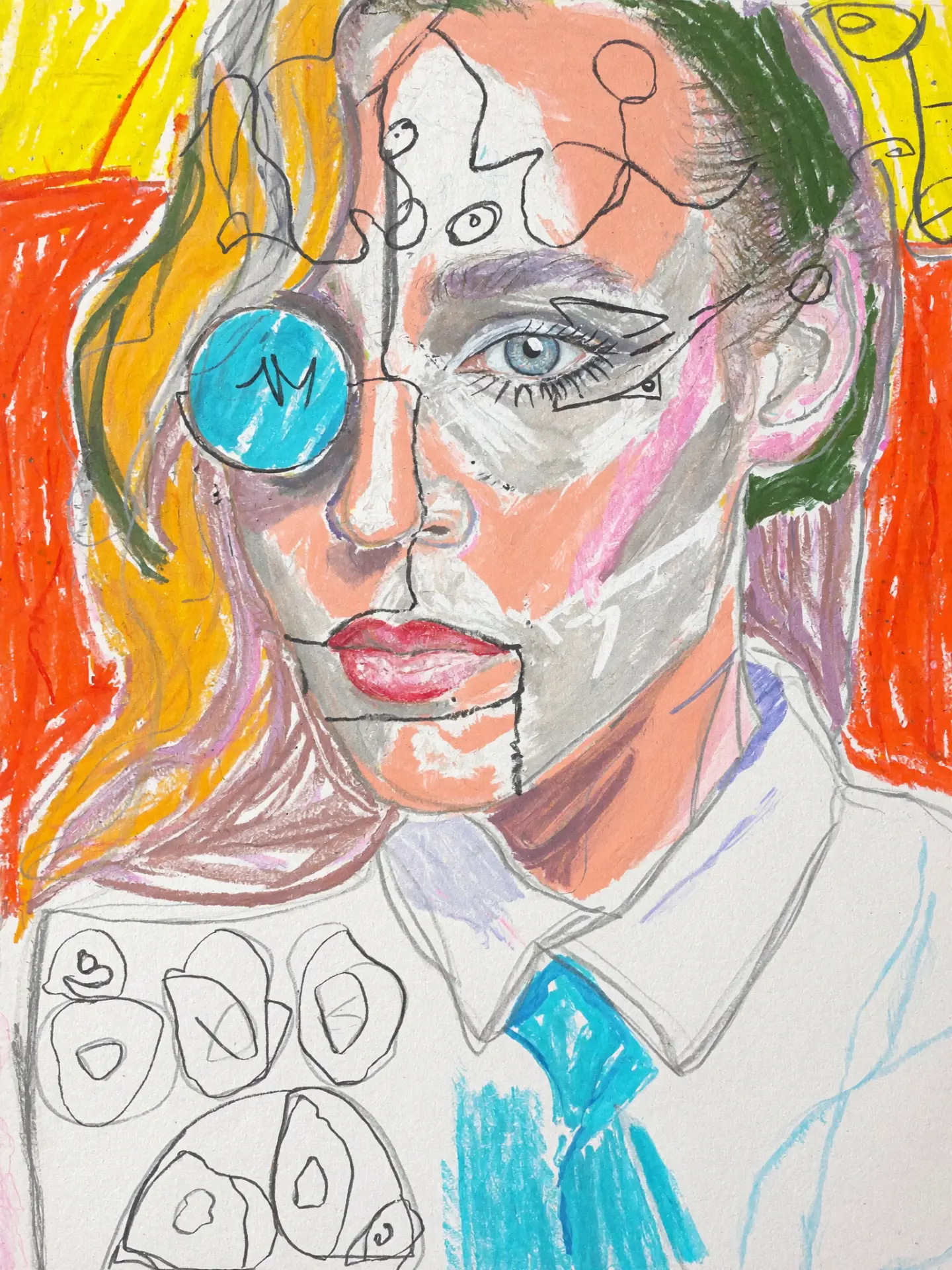
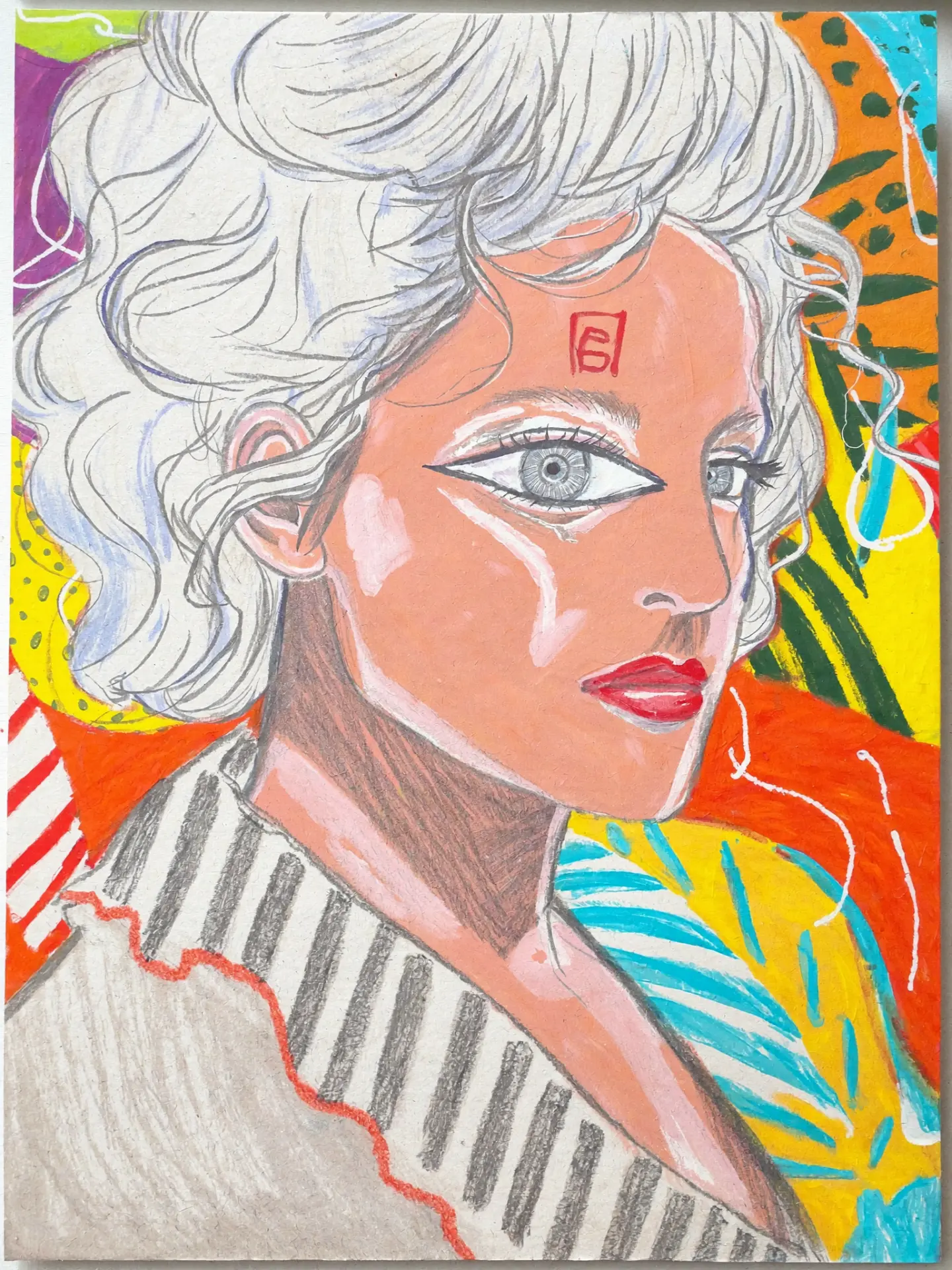
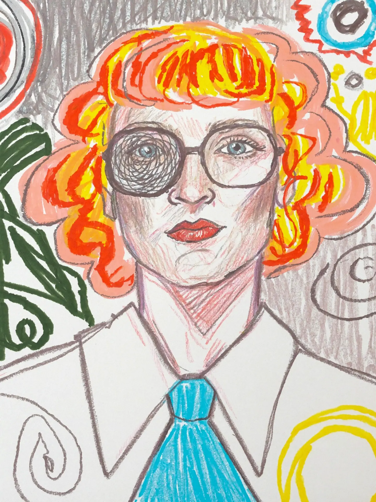
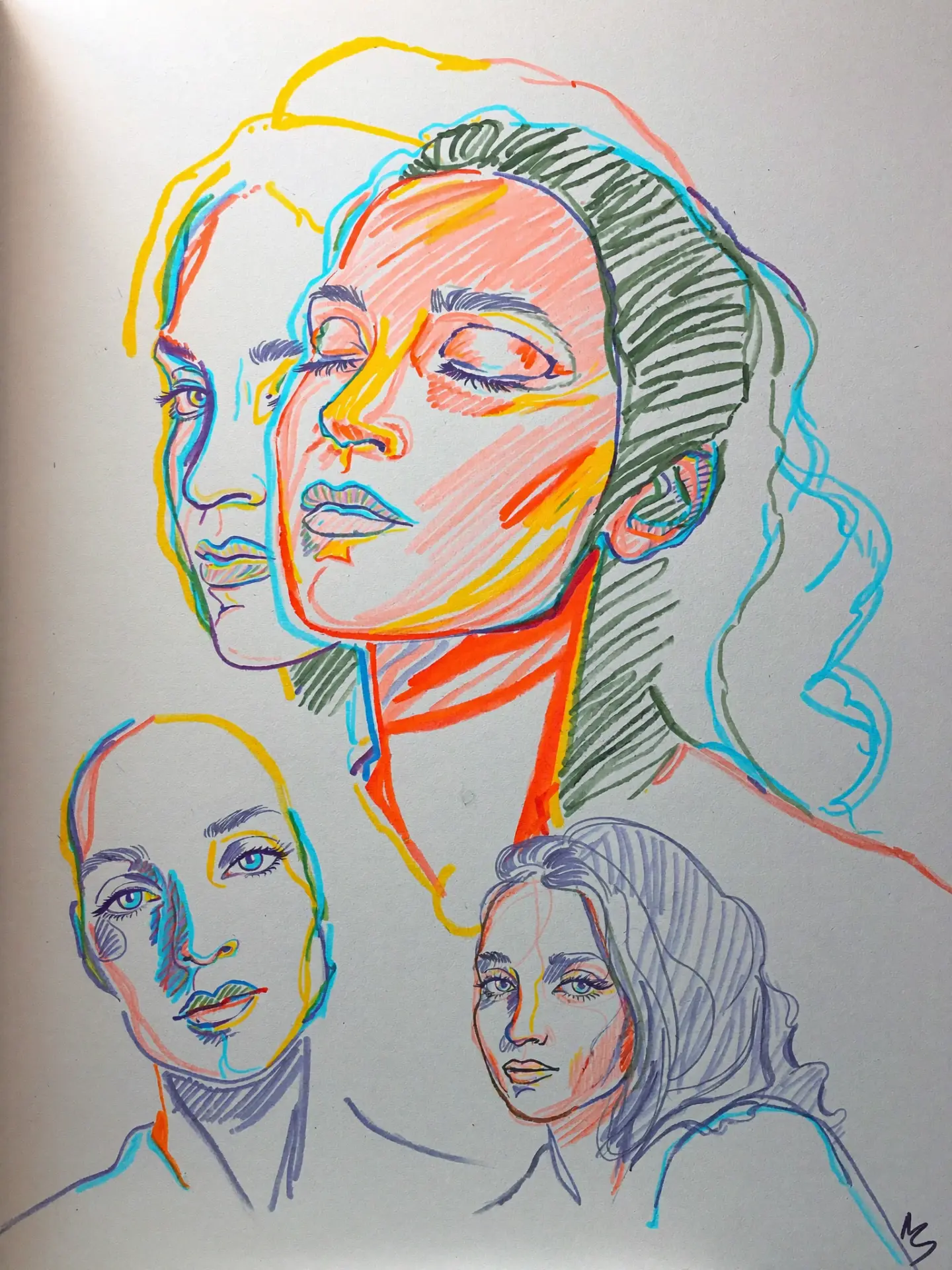
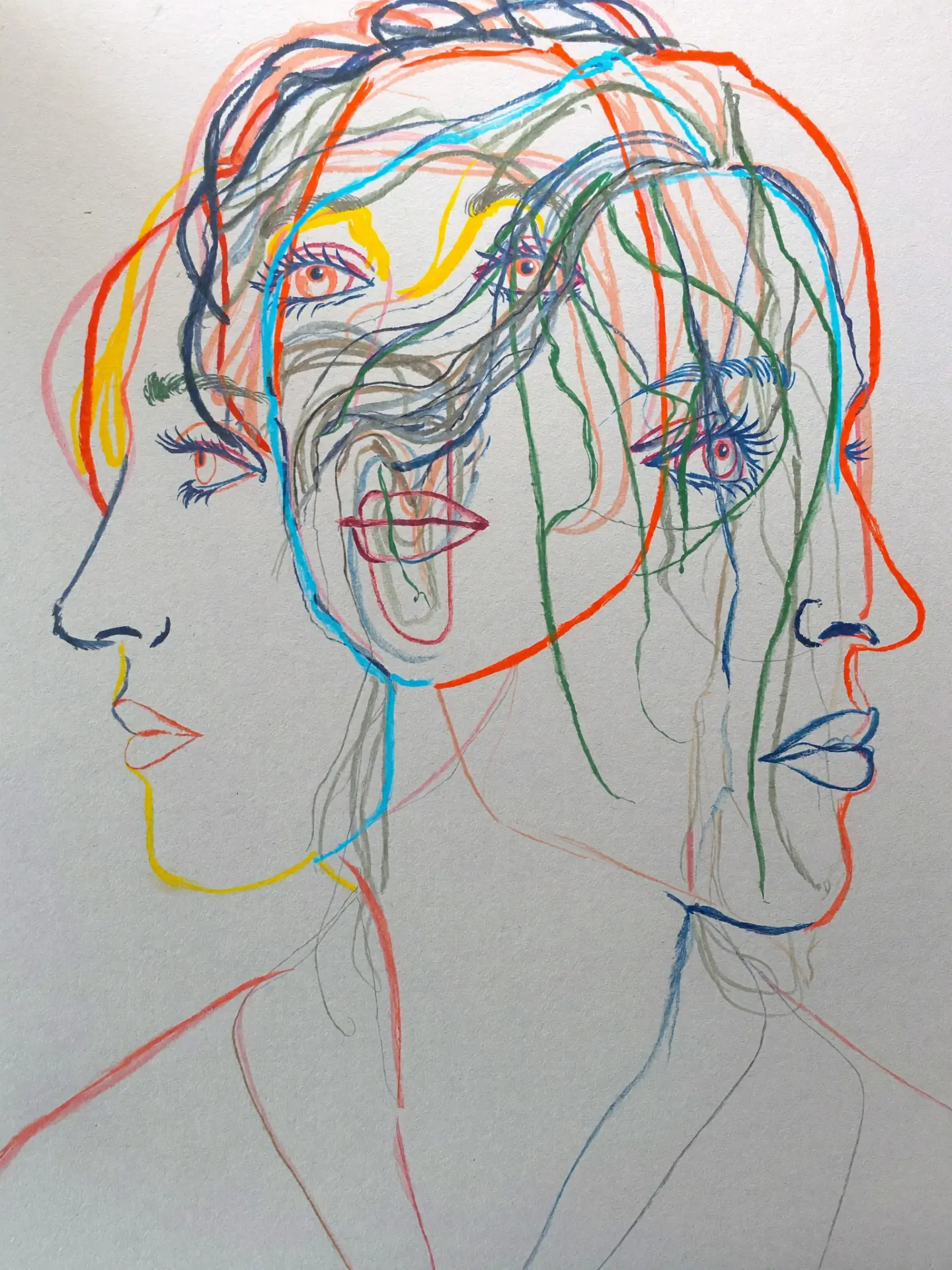
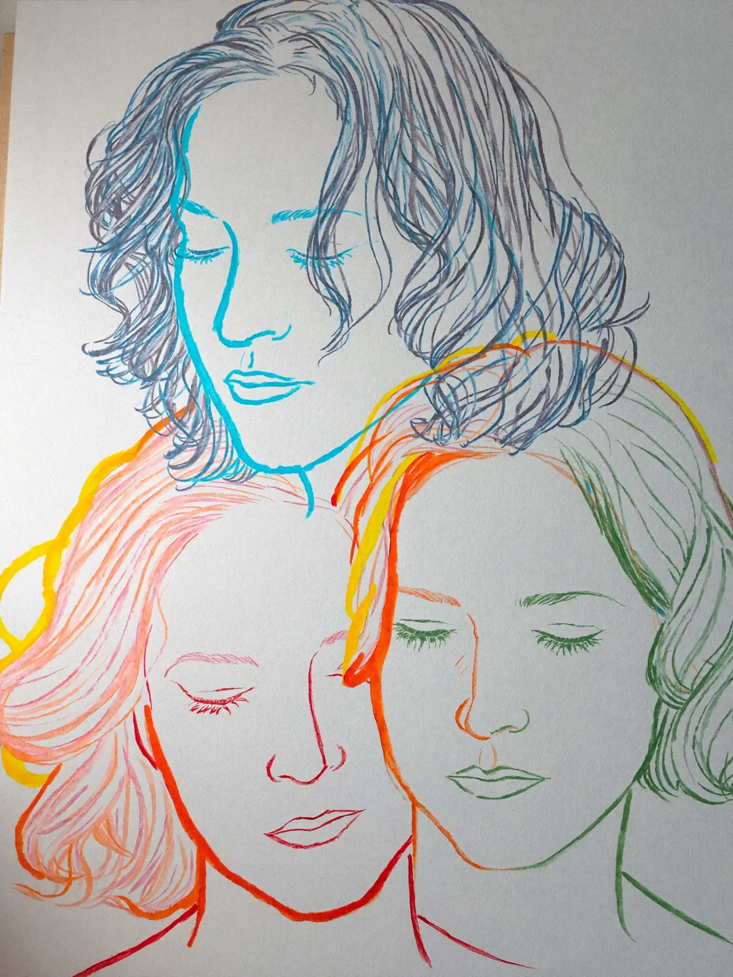
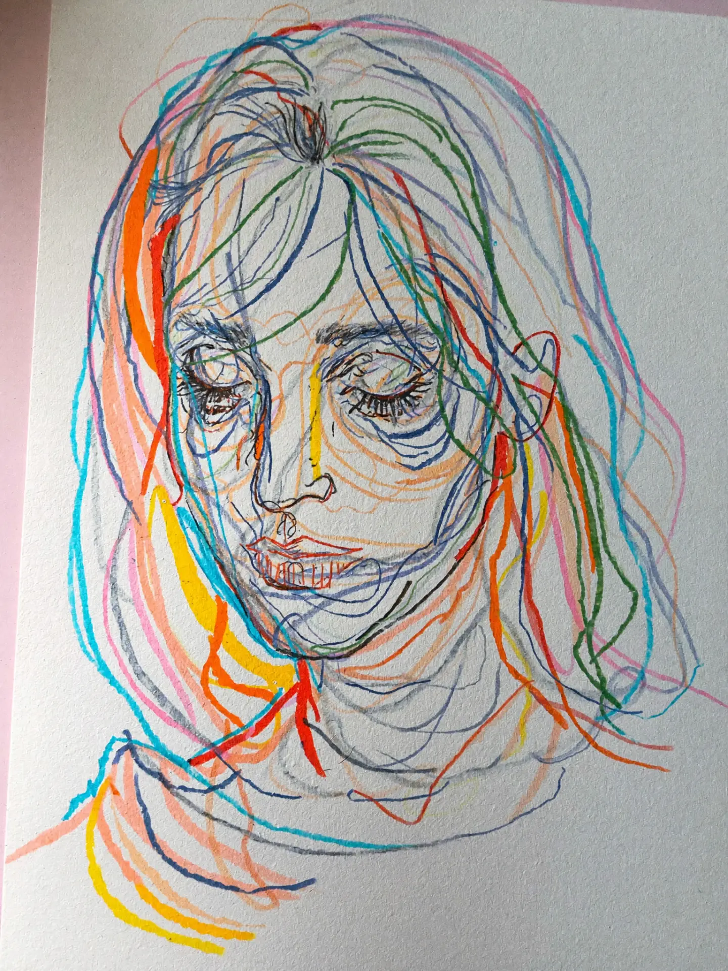
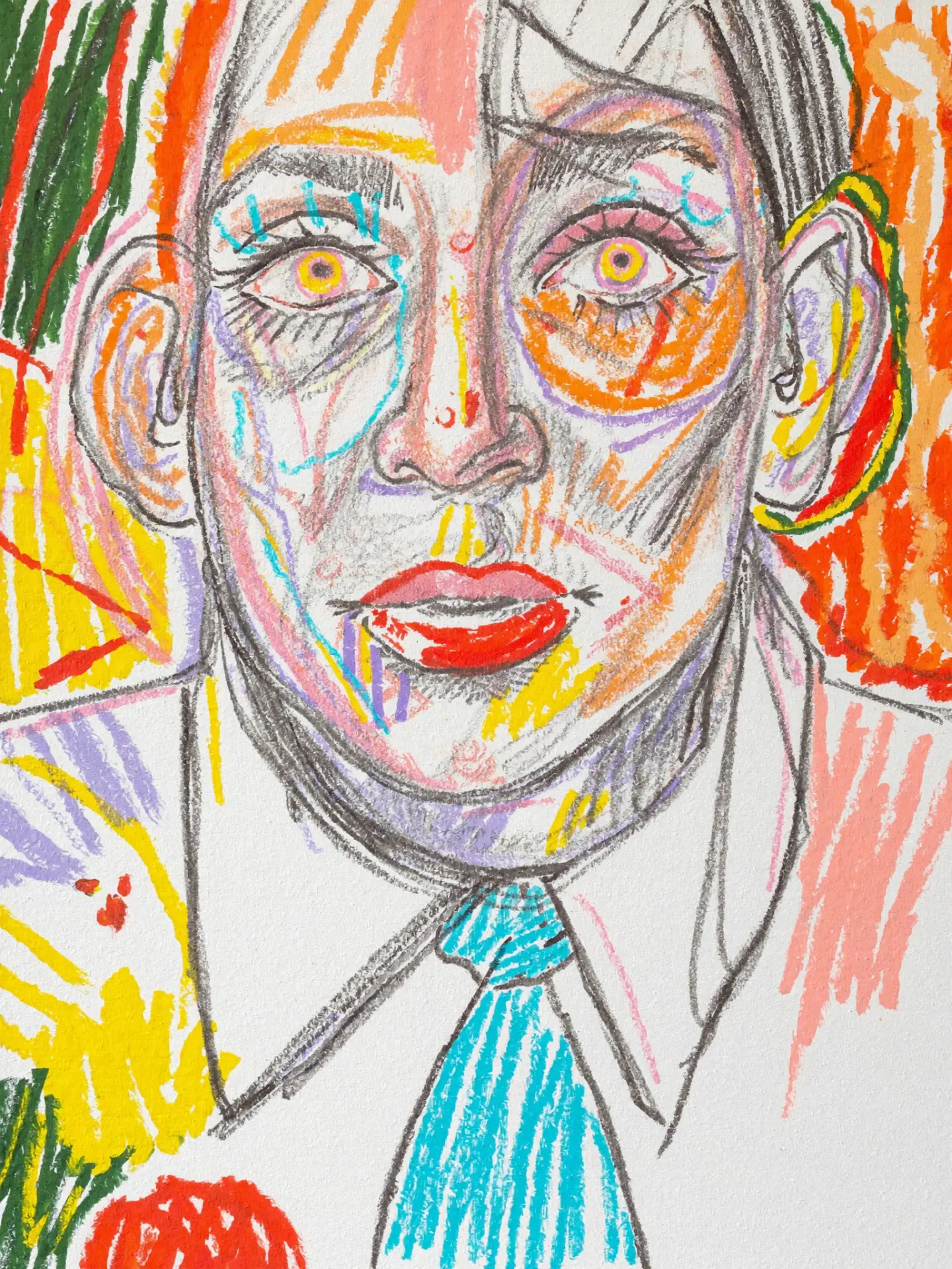
Marker, oil pastel, pencil, and collage; an acid palette — yellow, vermilion, cyan, moss — on cream paper; deliberate incompleteness of line, grain, and "stuck-on" shadows. The rationale comes from the product itself: vinyl is noise, grain, defect, and manual ritual. A perfectly smooth digital interface would contradict what the store sells. Form follows medium.
×No photo gallery — expensive and becomes outdated instantly.
×No marketplace grid — that's a return to the price battlefield.
×No dark 'audiophile' theme — the visual code of dozens of competitors.
×No wow animations without a function — they won't survive maintenance by one person.
05 · each page as an answer to a goal
Deflect the expectation of 'cheap here' and establish 'curated here'
A spinning record with a portrait at its center. The first screen says in two seconds: this is not a warehouse, this is a place.
View page →Transfer the atmosphere of the room into digital
A wall of portraits with genre tags and quotes. Clicking a face plays the track that person was listening to.
View page →Prove that the community exists
A dense mosaic of dozens of pencil portraits. Social proof made of graphics, not reviews.
View page →Offer a way to choose that a marketplace doesn't have
Filter by genre and — crucially — by color. Vinyl is chosen first with the eyes, then with the ears.
View page →Create an emotional contact with expensive gear
Equipment as a living illustration: the apparatus warms up on hover, and a real record starts spinning on click.
View page →Convert traffic into an offline visit
Booking a listening session — the point where high-check equipment is sold.
View page →Turn the brand style into a product
Order your own portrait: a brand asset the customer takes home and shows to others.
View page →Give a reason to come back
Notes on finds and repairs — content one person can maintain in a couple of hours.
View page →06 · business effect
The site sells curation and belonging, not price. This protects margin.
It's in the showroom that high-check equipment is sold. The site leads there with its entire structure.
Commissioned portraits — a separate revenue stream the store didn't have before.
A new portrait and a note — hours of one person, not a shooting day.
Portraits are forwarded. Every visitor becomes a carrier of the brand.
In a year — a collection of hundreds of portraits: merch, an in-store exhibition, covers, events.
07 · metrics proposed to the client
We started not with a layout, but with a question: what does the customer pay this shop for when the same record is cheaper on a marketplace? The answer was one — for curation and for people. So the site had to sell people, not items.
We worked within strict constraints agreed up front: no photography, no music rights, no right to publish visitors' faces, a small inventory, and one person on content. All of these limitations are resolved by one decision — original illustration.
The style — marker, pastel, grain, acid palette on cream paper — came from the medium itself: vinyl is about noise, ritual, and imperfection, so a perfectly smooth digital interface would contradict what the shop sells. The form follows the medium.
In the end, the site moves the shop off the price battlefield, converts traffic into the Listening Room, and turns every visitor into a brand carrier. And it can be maintained by one person.